
The greatitself identity
Brand resources.
Download the greatitself logos, symbols, app icons, and social artwork, with light and dark previews and a few simple notes on using the identity.
A mark. A name.
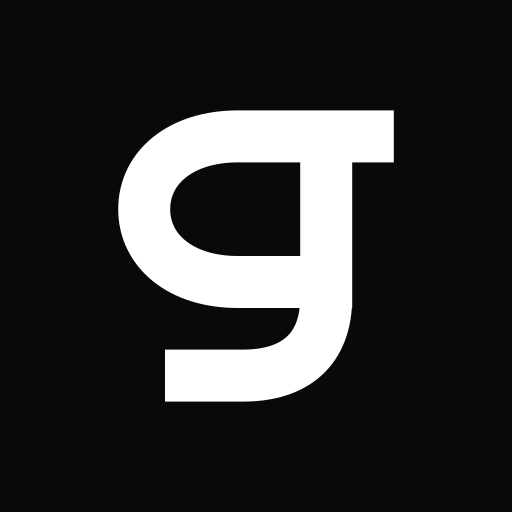
The Return symbol is an open lowercase g, with a stroke that finds its way back. The full logo pairs it with the greatitself wordmark.


All logo files have transparent backgrounds and outlined lettering. They scale without losing detail and need no installed font.
For the smaller spaces.
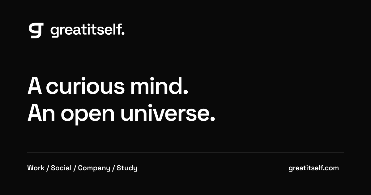
App icons and ready-made artwork for a link preview. Use the maskable icon when a platform crops an app icon into its own shape.


A little room to breathe
Keep it clear.
A few simple choices keep the identity easy to recognize, wherever it appears.
Choose the contrast.
Use dark ink on light backgrounds and white ink on dark backgrounds. Preview backgrounds show the intended contrast; the logo files themselves are transparent.
Keep the proportions.
Resize from a corner so the shape stays intact. Use the symbol for compact placements, and the full logo where the name has room to be read.
Leave some space.
Keep at least one stroke width of clear space around the mark. Give it more room in larger layouts, away from nearby text and edges.
The wordmark uses outlined Space Grotesk lettering. Download the font licence